Pointing a camera at your own head
An AI color-matching experience built so a first-time customer could complete it unassisted.

ROLE
Product Designer
TEAM
Ecommerce team, external technical partner, me
PLATFORM
Mobile web
CATALOG
40+ shades
The problem
Hair extensions have a matching problem most ecommerce categories do not. A customer has to identify their own hair color, from memory, on a screen, against forty-plus shades with subtle variations in tone and depth. Screens are not color-calibrated. Lighting changes everything. People are genuinely bad at naming their own hair color. Get it wrong and the product arrives, does not match, and goes back. A technical partner was building the AI engine.
The engine was not the problem. Getting a usable photo was.
The real design problem
The system needed a well-lit, correctly angled photo of someone’s hair. That request runs into four walls: • Trust: asking a first-time visitor to turn on their camera. • Competence: most people do not know what makes a good photo for color analysis. • Patience: every step is a place to abandon. • Confidence: an AI match is only useful if the customer believes it enough to buy.
Earn the camera before asking for it
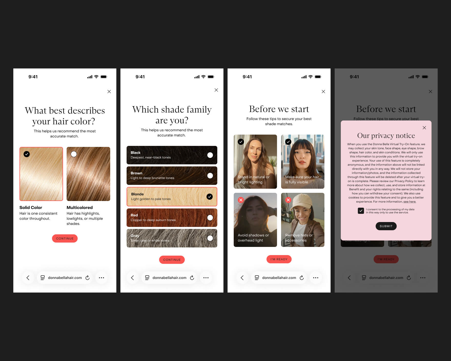
The flow opens by asking the customer to describe their hair: solid color, or multicolored with highlights and balayage. It is an easy question, useful context, and gets someone participating before asking for something hard. Then a short preparation step shows what a good photo looks like: natural light, hair visible, no filters, no hats. A customer who takes a bad photo and gets a bad match blames the product. The permission request is preceded by a plain-language explanation of what happens to the photo, before the browser’s own dialog.
Direct the capture, live
The capture sequence does not just open a camera and hope. The customer is guided through positions with on-screen framing and a live countdown: hold still, look straight ahead, turn slightly right, turn slightly left. Each angle gives the engine a different read on tone and depth. This is the heart of the experience. It is the difference between “take a selfie” and being directed—and direction is what makes an untrained person produce a usable result.

Design for failure, not just success
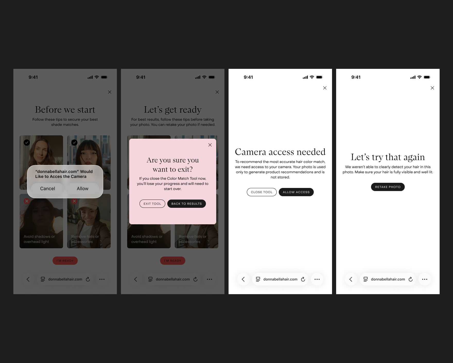
Camera denied. Photo unusable. Customer exits halfway. Each gets a specific, recoverable screen rather than a dead end. Camera denied explains how to enable it and offers to continue without. An unreadable photo explains why and invites a retake. Exiting mid-flow asks whether to save progress. For a flow that asks this much of someone, recovery paths are not edge cases. They are a meaningful share of sessions.
Make the answer believable, then shoppable
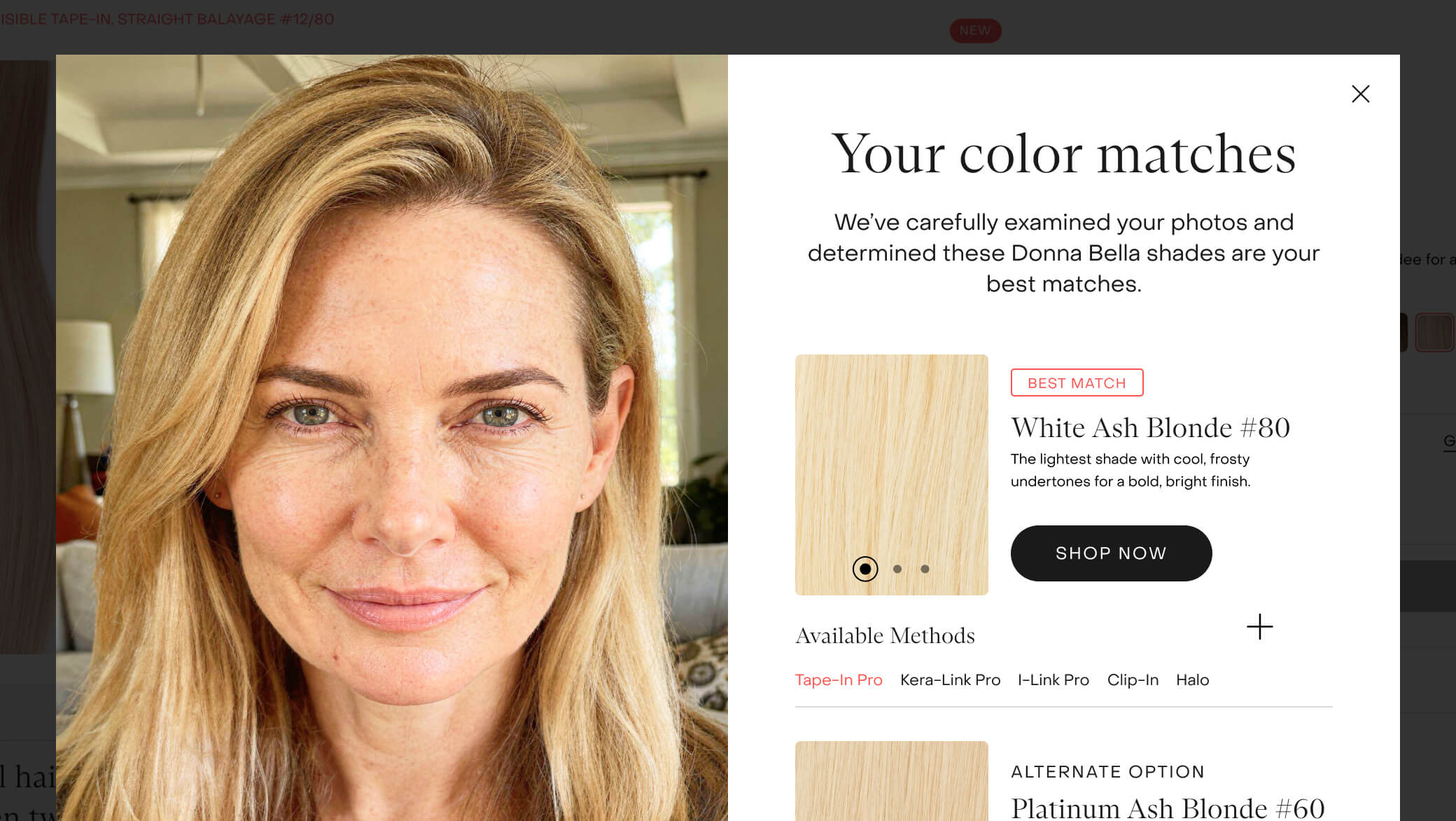
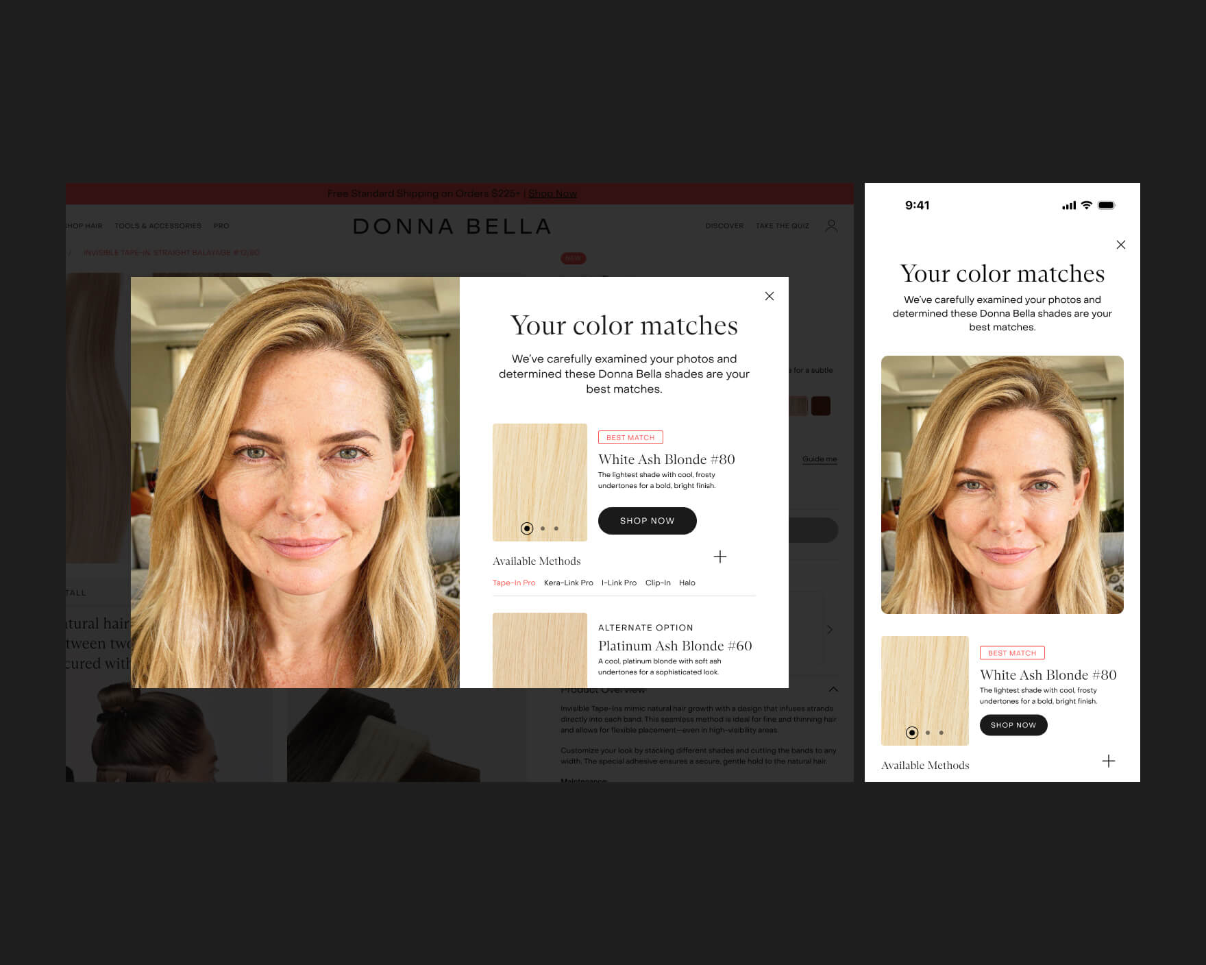
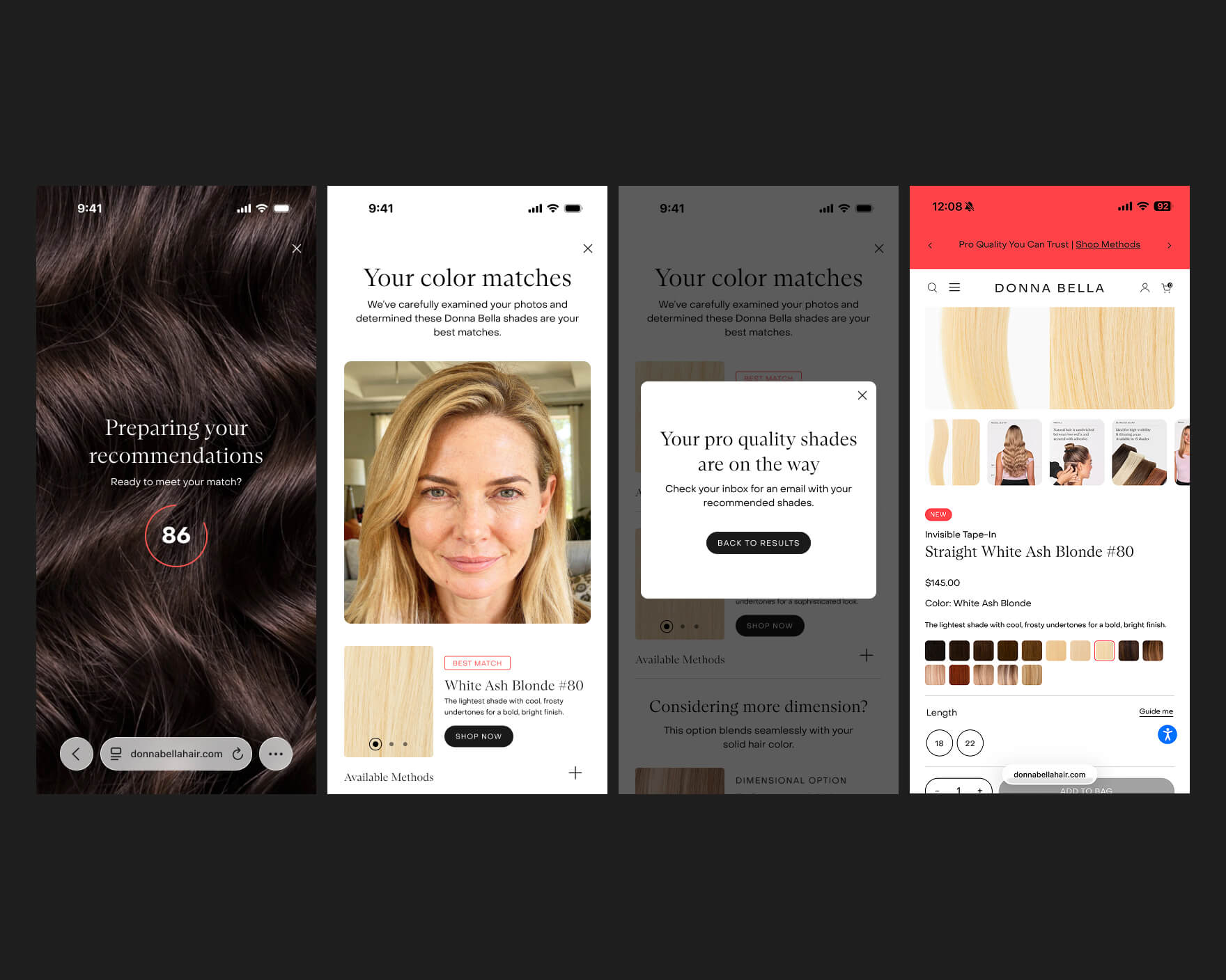
The results screen leads with the primary match, then alternates, dimensional options for more depth variation, and available methods for each shade. The customer’s own photo sits alongside the match so they can verify the recommendation themselves. Results can be emailed because extensions are a considered purchase. From results, the customer moves into a filtered product listing and then a product page carrying their matched shade through. The match is the front of the purchase path, not a novelty on a separate page.
What I had to work with
Someone else’s technical framework
An external partner built the engine and defined the inputs. I designed everything required for a stranger to feed it something usable.
Uncontrolled conditions
No calibrated screens, controlled lighting, or known device.
Browser permission behavior I did not own
I could shape everything before and after the browser prompt, but not the prompt itself.
Mobile-first, non-negotiable
The premise requires a camera in the customer’s hand.
What I learned
UP NEXT

